

Website Redesign for fAIshion
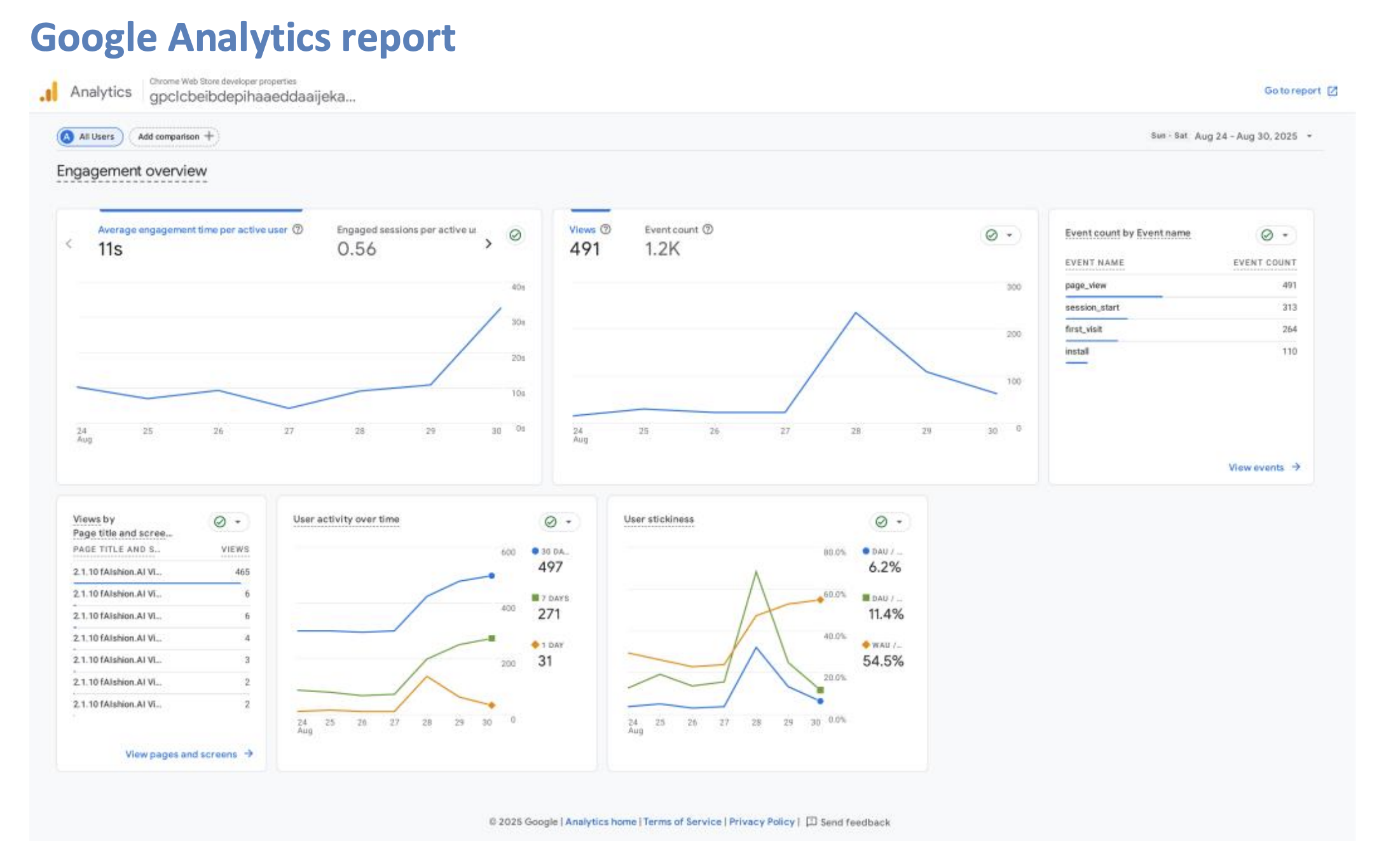
fAIshion.AI is an AI-powered fashion technology platform that helps users discover, style, and shop clothing through virtual try-ons and an upcoming intelligent recommendation and mix-and-match system. After launching our redesigned experience, we saw user engagement rise by 10%, bounce rates drop, and CTA conversions jump from 6.4% to 21.2%. Enhanced FAQs and navigation reduced user frustration, while retention and satisfaction noticeably improved thanks to positive feedback on both mobile and desktop.
| Team
Myself
a Designer
a Front-End Dev
Data Analysts
| My Role
Product Manager
| Timeline
Jun- Sep 2025
Overview
fAIshion.AI is an AI-driven fashion platform that helps users discover, style, and shop outfits with smart recommendations and interactive tools. It uses advanced language models to offer personalized looks, mix-and-match styling, a clothing chatbot, and try-on history for a seamless shopping experience.
Problem
Research and Discovery
As user expectations and digital trends evolved, the website faced several challenges:
Low conversion rates: Users were dropping off before completing sign-ups or engaging with core product features.
Unclear call-to-actions (CTAs): Key CTAs weren’t prominent or intuitive, leading to missed user actions and underperforming engagement.
Outdated UI and poor mobile experience: The website’s visual design didn’t reflect the brand’s innovation and was difficult to navigate, especially on mobile devices.
Business and User Goals
To address these issues, the redesign project aimed to:
Boost sign-ups and conversion rates by streamlining the onboarding process and enhancing CTA visibility.
Increase user engagement and retention with an intuitive, visually compelling experience across devices.
Refresh and align the site with fAIshion.AI’s brand identity as a leader in fashion AI, showcasing innovation and user-centric design.
Enable faster, clearer adoption of new features such as mix-and-match styling, AI-powered chatbot, and social integrations.
Process & Solutions + Key Features/Improvements
We navigate the gaps in engagement and navigation, I worked through a structured workflow: discovery, ideation, prioritization, design, and implementation. I started by mapping out our user flow pain points and solutions and brainstorming solutions with the team, focusing on areas causing the most drop-off.
We prioritized redesigning the landing and onboarding flow, making call-to-actions much more visible and intuitive. I collaborated closely with designers and engineers, using wireframes and flow diagrams to visualize the new experience from landing page to About Us. Our approach was highly iterative. We rapidly prototyped changes and ran usability tests to validate what worked.
For the hero screen landing page, we made clothing items interactable for users and added a prominent CTA button to download the extension.
On the Virtual Try-On section, we clarified messaging and layout, making value props and steps much more understandable to new visitor.
In the How It Works section, we ensured the CTA button uses clear, direct wording and highlighted the pathway to download the extension. We also added a user-friendly FAQ for quick answers to common questions.
The Contact Us page now features a clear, easy-to-read form alongside working social media buttons for real-time support.
The About Us page is transparent, readable, and provides detailed information about all team members.
Reflection and Learnings
This project reinforced the value of using real data and user feedback to guide every design iteration. I learned that even small changes, such as making CTAs clearer or buttons more interactive, can significantly boost engagement and conversion. The experience also highlighted the importance of cross-team collaboration and stakeholder input in launching a seamless and impactful product. Going forward, I want to build on these lessons by introducing new engagement features and continuing to refine the user journey through ongoing testing and analytics.